
UX Governance at scale: One System, 100+ Products
Responsive by design. A component library and governance model built to bring consistency to a fragmented product ecosystem — across every device.


Problem
A growing ecosystem of disconnected desktop applications with inconsistent UI patterns, duplicated dev work, no shared foundation, and no governance model — and mobile was coming.
Role
Led the design system initiative end-to-end — architecture, component design, responsive behavior, documentation, and engineering partnership.
Managed the engineering team responsible for implementing the React component library, including task prioritization and delivery planning.
Directed usability testing and internal feedback sessions to validate patterns and improve consistency across products.
Created system documentation and canonical examples to support designer and developer adoption.
Constraints
Components had to work across desktop, phone, and iPad without additional design or dev work per product. iPad introduced a middle layer — large enough for desktop-like data density, but requiring touch-friendly patterns the desktop system had never solved.
Outcome
Shipped a unified Figma component library and React component library documented in Storybook. Built and instrumented a behavioral analytics system across the full product suite, increasing analytics coverage from under 10% to over 90%. The system later enabled a company-wide rebrand to roll out across the product suite faster than would otherwise have been possible.
Desktop

Tablet

The component library was built to allow the majority of our desktop apps to be translated seamlessly to a mobile form factor.
1. Context & problem
Our product suite had grown into several separate desktop applications built by different teams, producing overlapping UI patterns, inconsistent interaction models, and duplicated design and engineering effort. There was no shared source of truth.
Mobile made the problem urgent. As handheld devices moved into the workplace, teams were solving responsive challenges independently — compounding fragmentation rather than resolving it. iPad added a specific wrinkle: technical constraints meant our unified mobile app suite couldn't load desktop versions of apps on iPad, so clients were stuck with phone layouts on a large screen. The case for a purpose-built responsive system became impossible to ignore.


In addition to building the Figma components for our designers to use, I also built dozens of examples for them to copy into their own designs. This helped drive consistency in UI designs and made the product suite easier to use.
2. Constraints & scope
-
Every component needed desktop and mobile variants — designed together, not retrofitted
-
Responsive behavior had to be defined at the system level so teams didn't solve it independently
-
The Figma library and React component library had to stay in sync as a shared source of truth
-
Documentation had to support adoption by both designers and developers without hand-holding
-
Components had to work within the existing product architectures teams were already building on
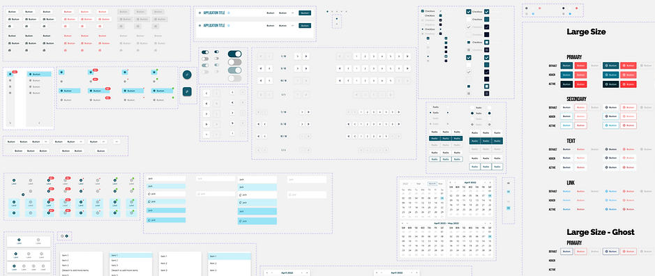
I created over 500 components with multiple variants for each. This includes responsive variants for desktop and mobile platforms.
3. Research & insights
Testing components rather than whole products let us use internal employees as a fast feedback source, making iteration quicker than traditional product research. Visual feedback came from internal stakeholders, and close partnership with the marketing director ensured the design language aligned with the company's external brand.
-
Inconsistent patterns increased cognitive load. Users who moved between product areas noticed discrepancies immediately — surfaced first in usability testing, and later confirmed at scale through behavioral analytics once instrumentation was in place across the suite.
-
Responsive behavior needed a system-level answer. Left to individual teams, mobile layout challenges produced inconsistent results across the product suite.
-
Documentation was the difference between adoption and shelf-ware. Copy-ready examples mattered as much as written guidance.

Extensive design documentation helped create UI consistency among different product lines.
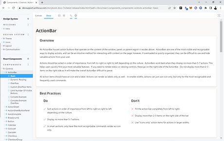
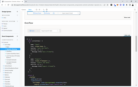
Our team produced developer documentation for all components, which was key in driving adoption internally. We also got buy-in from the developers as we designed the components' technical implementations, ensuring a smooth roll-out and a high degree of internal alignment upon completion of the library.
4. Leadership & influence
I managed the engineering team responsible for implementing the React component library — owning task prioritization, delivery planning, and ensuring design translated cleanly into production components.
I also partnered closely with the CTO, VP of Development, two chief software architects, and three product managers to align the system with engineering constraints and real product needs. The entire development org had input into component implementations — making adoption a shared outcome rather than a top-down mandate. Company-wide demos gave anyone in the organization the opportunity to offer feedback as the system evolved.
One initiative I drove without a formal mandate was building out UI behavioral analytics across the product suite. The organization had minimal visibility into how clients were actually using the platform — which tools they relied on, which features went untouched, where friction accumulated. I made the case for instrumenting user behavior at the component level, not just at the page level, and led the effort to build the tracking and reporting infrastructure. The consistent naming and structure the design system established made that granularity possible: because every product used the same components, we could track interactions meaningfully across all of them.
One area I also drove proactively was accessibility. We audited the full color system for color-blind friendliness, verified data visualization color brightness, and introduced distinct iconography for status notifications — so state and meaning were never communicated by color alone.


5. Key decisions & tradeoffs
Pushed for mobile components over internal resistance
Versions 1–7 were desktop-only. Architects resisted mobile parity, arguing our apps were too data-heavy for small screens — reasonable for phones. The iPad problem made it unavoidable: clients were getting phone layouts on large-screen tablets and couldn't understand why. Version 8 became a full integration of desktop and mobile designs.
Replaced Excel-style tables with touch-friendly list patterns
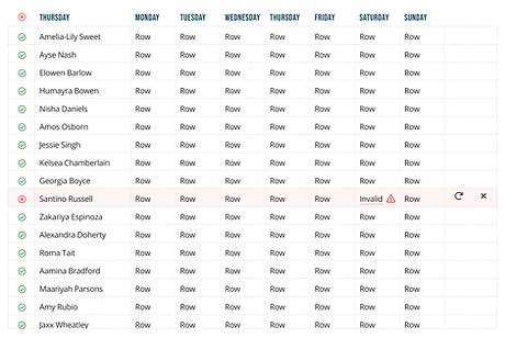
Dense data tables worked with a mouse but were unusable on touch devices. Touch targets, scrolling behavior, and information density all had to be rethought from the ground up — not just resized.
Introduced context-sensitive navigation for tablet
Persistent desktop sidebars were redesigned to hover and auto-dismiss on iPad, preserving content space while keeping navigation accessible. The same component had to behave differently by device — tablet couldn't be treated as a simple middle ground between desktop and phone.
Instrumented the full product suite at the component level
Once the design system gave every product a shared component vocabulary, we had an opportunity to instrument behavior in a way that had never been possible before — tracking interactions by individual UI element, not just by page, consistently across 100+ tools. I built out a behavioral analytics and reporting system that captured event-level data across the platform, segmented by client, application, device, and geography.


I created a number of analytics reports for our product teams to reference. More than once this data enabled us to adjust our schedules or reorder our priorities as usage patterns and app popularity were revealed.
The reports surfaced things that usability testing couldn't: which applications clients actually relied on day-to-day, which features were consistently ignored, how usage varied by client and region, and where sessions were longest — a proxy for where users were working hardest. That data fed directly into design prioritization decisions, giving the team a way to focus effort on what clients were actually using rather than what the roadmap assumed they were using.
6. Outcomes & reflection
Design status at departure: Version 8 complete — desktop and mobile components fully integrated, responsive behavior defined at the system level.
Analytics coverage: The behavioral instrumentation effort increased analytics coverage across the product suite from under 10% to over 90%. For the first time, the organization had a reliable picture of how clients were using the platform across all major tools — which applications drove the most session time, which features were adopted versus ignored, and how usage patterns differed across clients and geographies. That foundation made it possible to prioritize design work against real usage data rather than assumption.
Longer-term impact: The component architecture enabled a company-wide visual rebrand to roll out across the product suite significantly faster than would otherwise have been possible.
I pushed for responsive components before the business case was obvious — and couldn't make the argument stick. It took the company encountering the iPad problem firsthand to validate what I'd been advocating for. Version 8 exists because of that collision between deferred decisions and a real client need. The analytics push followed a similar pattern: the value was apparent once the data started coming in, but getting there required advocating for infrastructure work that didn't ship a feature. Starting slow and demonstrating results helped make the case for the larger effort, but the process of socializing the project and demonstrating actionable results required a long and sustained effort.
